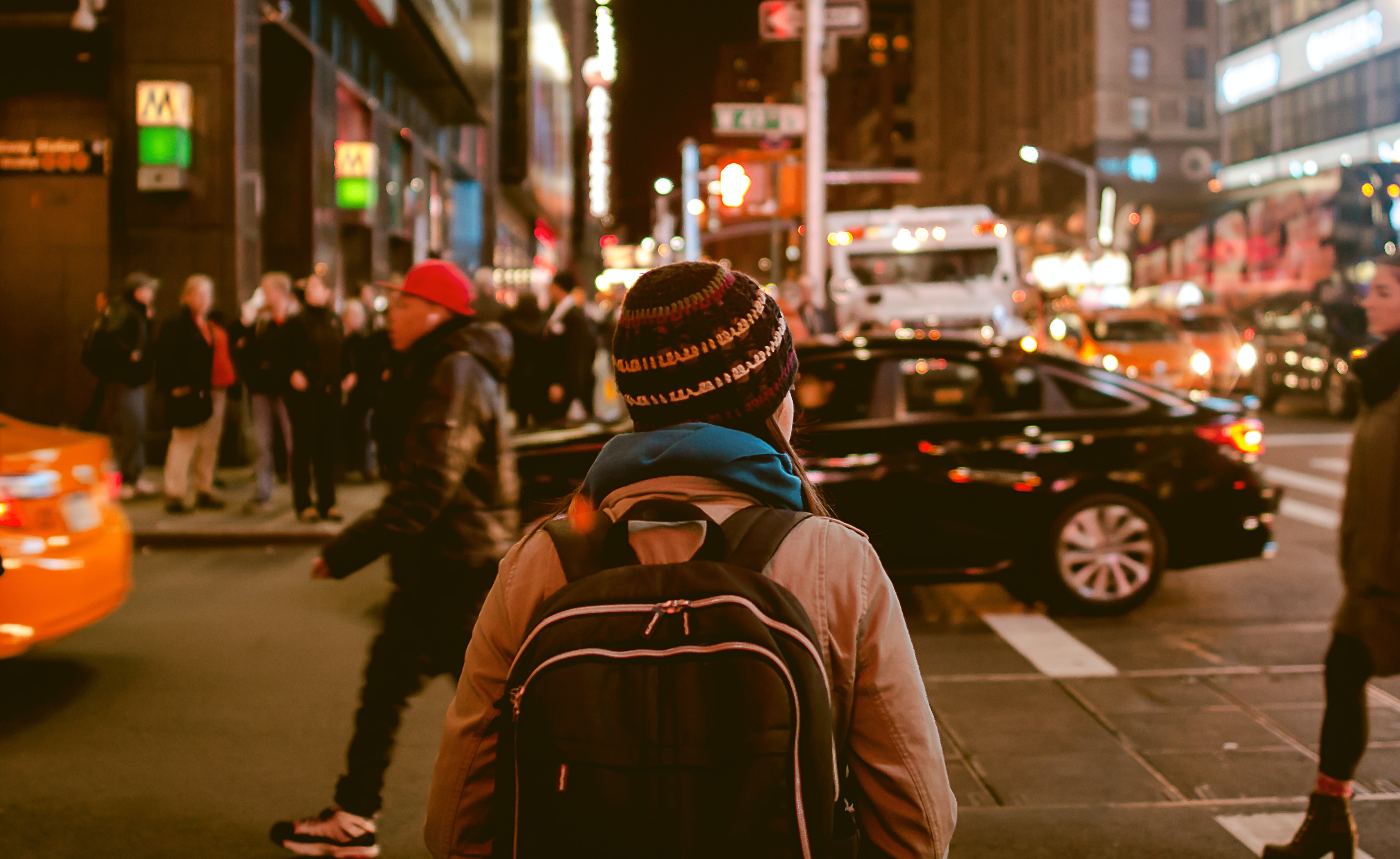
Traveling or commuting alone at night can often be a worrisome and daunting experience, with fears of potential assault, harassment and robbery. Only 50% of women and 20% men feel unsafe at night 1 with individuals between the ages of 16-34 are most affected by victimisation2.
Aligning this with the United Nation’s Sustainable Development Goals (UN SDGs), Target 11.7 focuses on the safety of public spaces that aim “...provide universal access to safe, inclusive and accessible, green and public spaces..” 3.
The Safer Together project aims to tackle the perception of safety and lack of safety in cities and public spaces with an creative and innovative solution that combines physical and digital interaction.
Photo by Anubhav Saxena (Unsplash)
our solution
Safer Together combats this problem of personal safety at night by invoking feelings of companionship, familiarity and safety to users. This solution consists of two elements - a personal keychain and an mobile application.
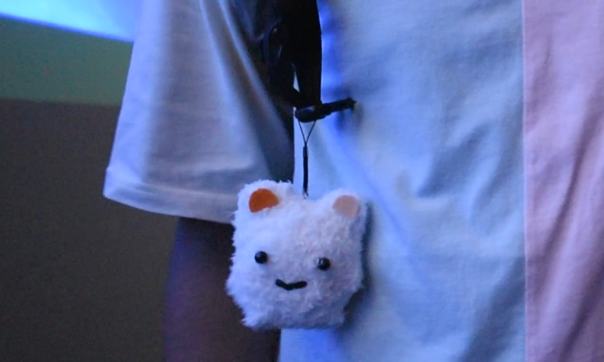
The personal keychain in a form of a small, plush toy acts as an easy-to-use protection device and symbol of safety within the Safer Together community. The app aims to create and build a network and community that users can choose to walk together when feeling unsafe or anxious in public spaces at night.
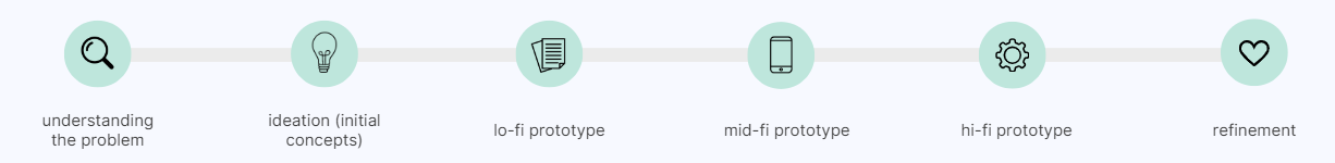
the design process
understanding the problem
To better understand our problem space, we began conducting background research and a competitor analysis to answer these following questions:
Who feels unsafe?
Why do they feel unsafe?
What existing solutions and strategies to tackle safety?
From our research, we identified several key insights and gaps, however, a clear and key insight was identified in majority of our research that the perception of safety outweighs the actual feeling of safety.
user research
With a more focused problem space, we proceeded to conduct semi-structured interviews and questionnaires to gain new and deeper insights into our target group’s perception of personal safety and the multiple factors associated with it.
Questionnaires allowed us to gain a large set of quantitative data focused on investigating people's perceptions of personal safety when travelling in public spaces or at night and factors associated to individual's sense of insecurity and fear.
Semi-structured interviews were framed for in-depth and rich insights about individuals' concerns, perceptions, and experiences of their personal safety when travelling in public spaces and/or at night.
All data was collated and analysed by our team through Affinity Diagramming where a set of high-level themes where identified showcasing some of the underlying users needs (Figure 1).
Figure 1: Snapshot of our Affinity Diagram containing all data collated
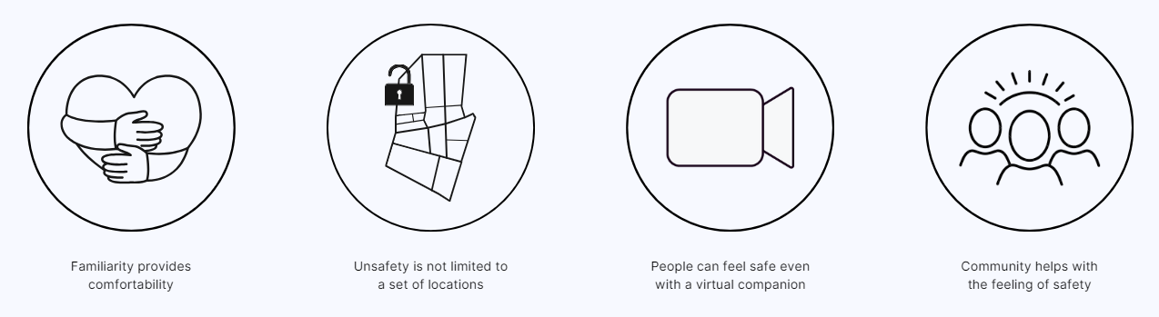
Four main themes surfaced that we found the most unique and distinct out of all the insights identified from our background & user research (Figure 2).
Figure 2: Four main themes identified
ideation
initial concepts
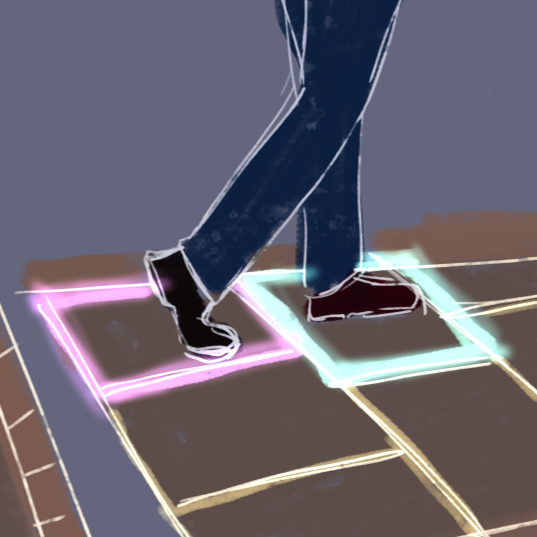
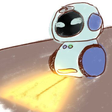
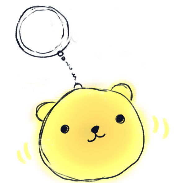
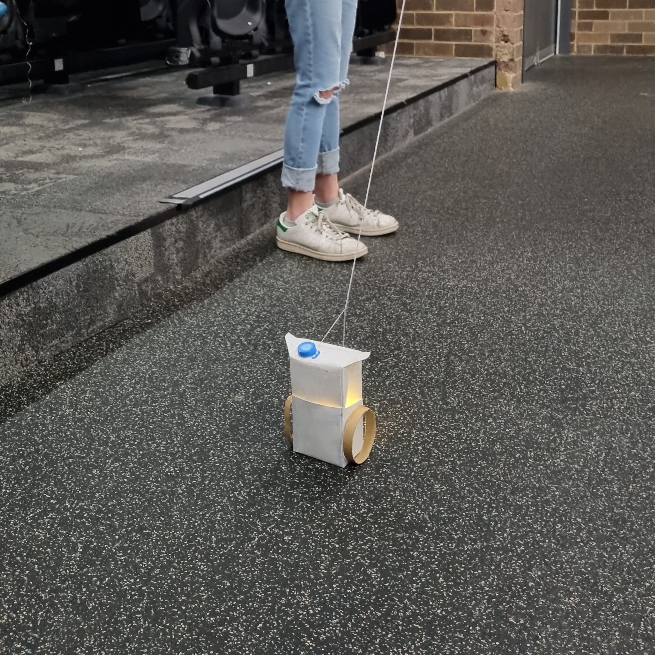
To address and design for these user needs, we proceeded to generate 32 ideas using Crazy8s to explore and visualise various and potential solutions from virtual people to a well-lit and secure bus stop. From our initial ideation phase, we began to narrow down our ideas into three concepts: an interactive illuminated pathway, a companion robot and, a night-walking application and keychain(Figure 3).
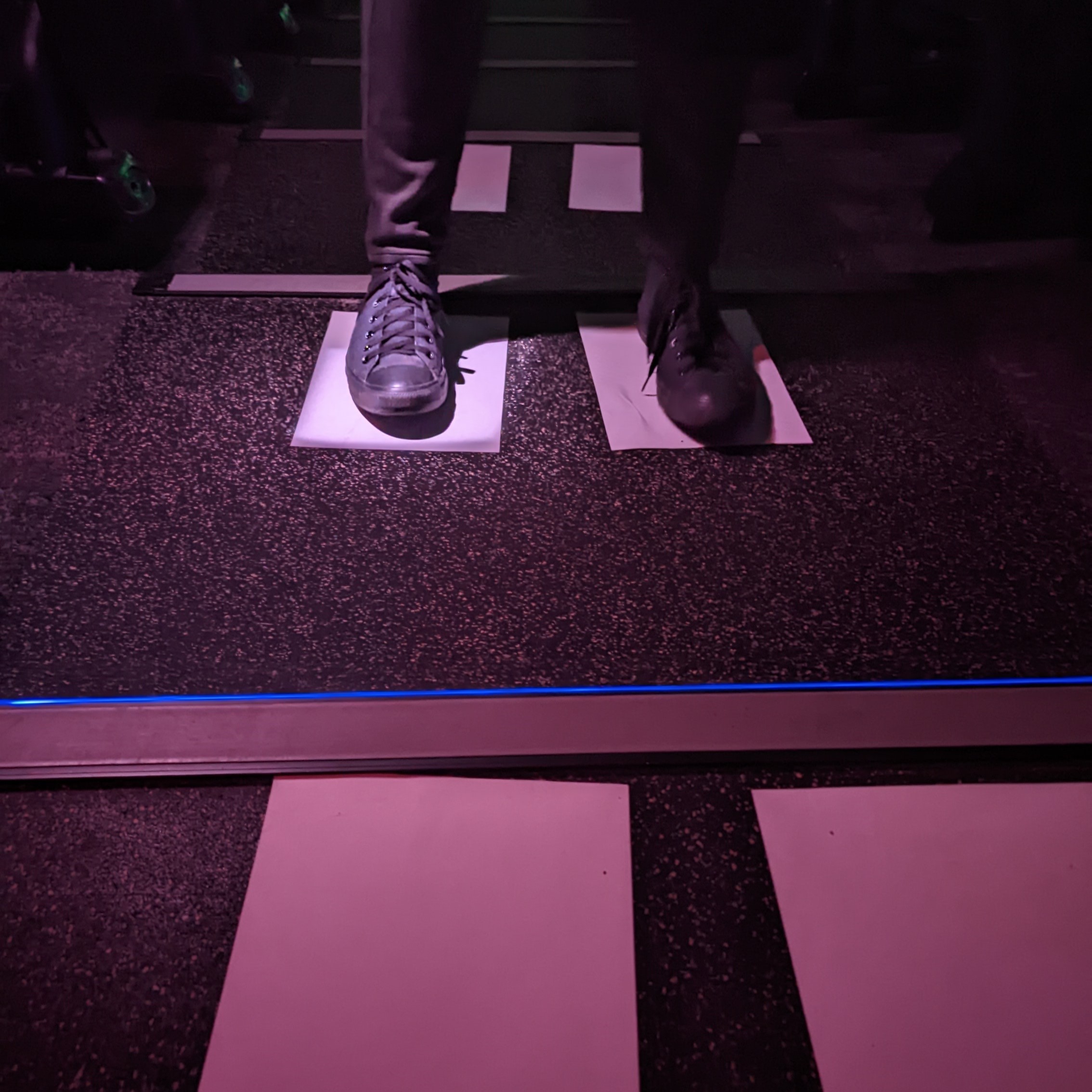
To assist in deciding our final concept, a user testing session was conducted with low-fidelity versions of these three concepts using paper prototypes and sketches. Each user experienced all three concepts through think-aloud tasks paired post-experience interviews, allowed us to determine the concept that evoked the actual feeling of safety within most users (Figure 4). With the user feedback received, a self-feasibility study and decision matrix conducted, Safer Together provided to be best concept in improving individuals’ sense of safety when walking alone at night.
No items found.
Figure 4 (Left to Right): Users testing our three concepts (Raito, Custos & Safer Together)
low-fidelity prototype
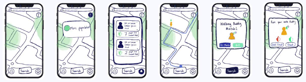
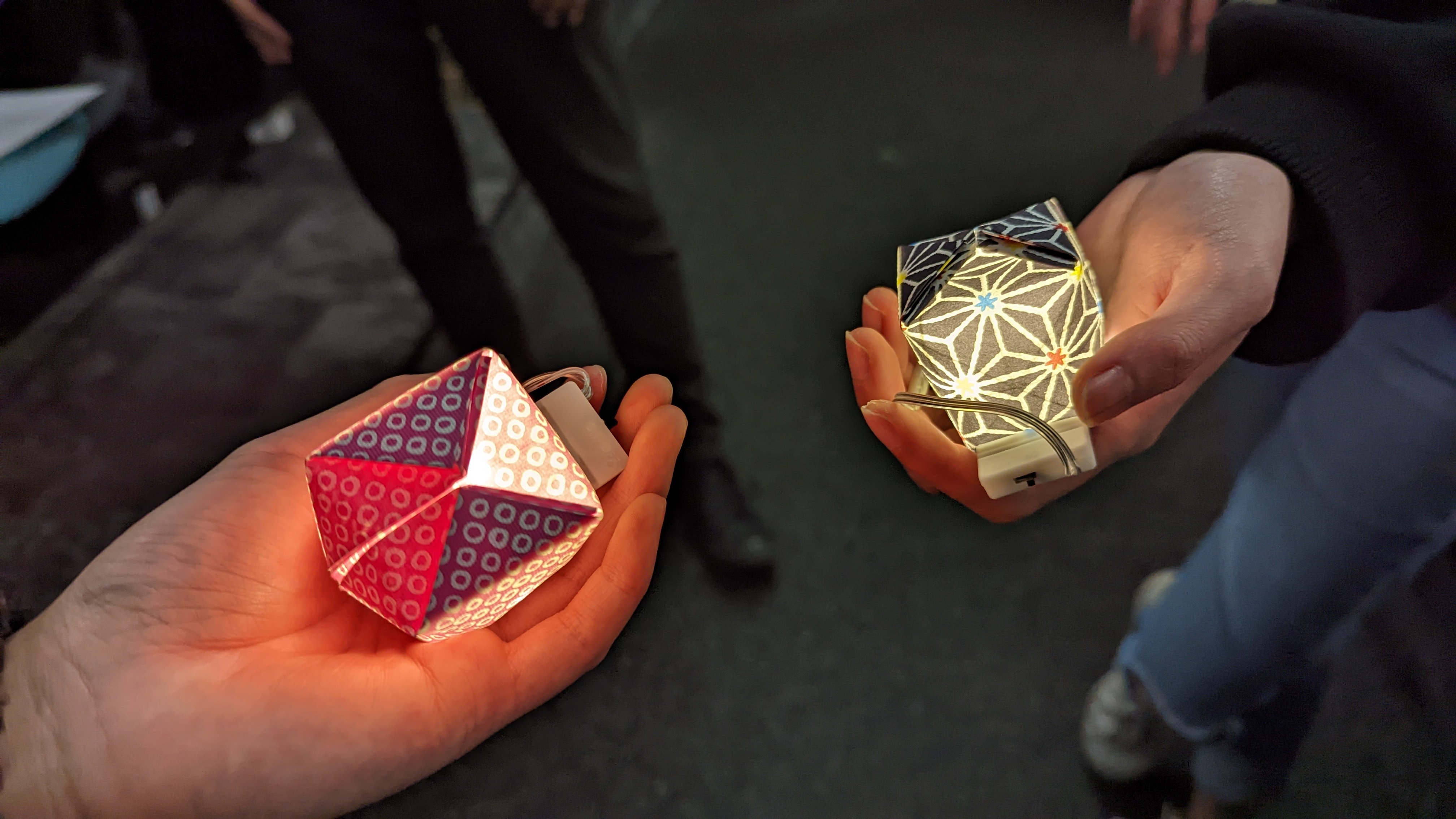
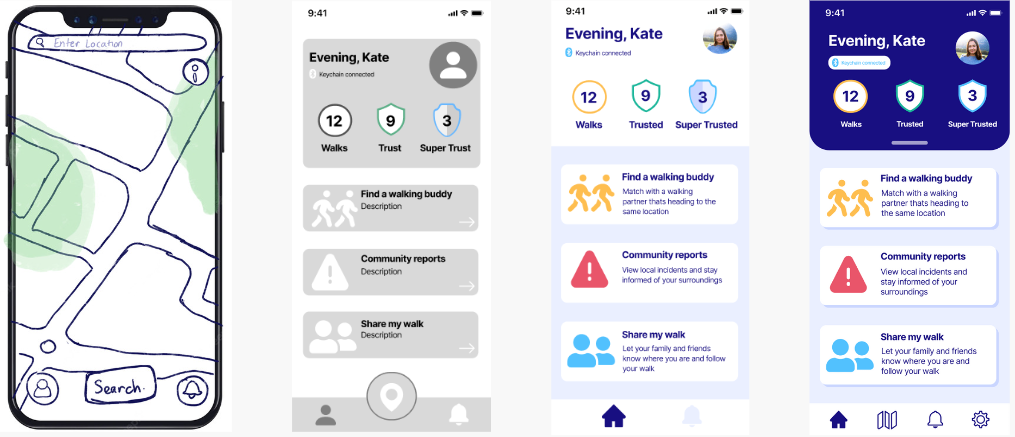
Our low-fidelity prototype embodied the basic functionality of our concept with the keychain in the form of an origami paper water balloon with fairy lights inside to indicate the on/off status. While, the app wireframes were digital sketches visualising the essential screens (dashboard, notifications, walking buddy matched & rating) (Figure 5 & 6).
Figure 5: Digital Interface Sketches (App)
No items found.
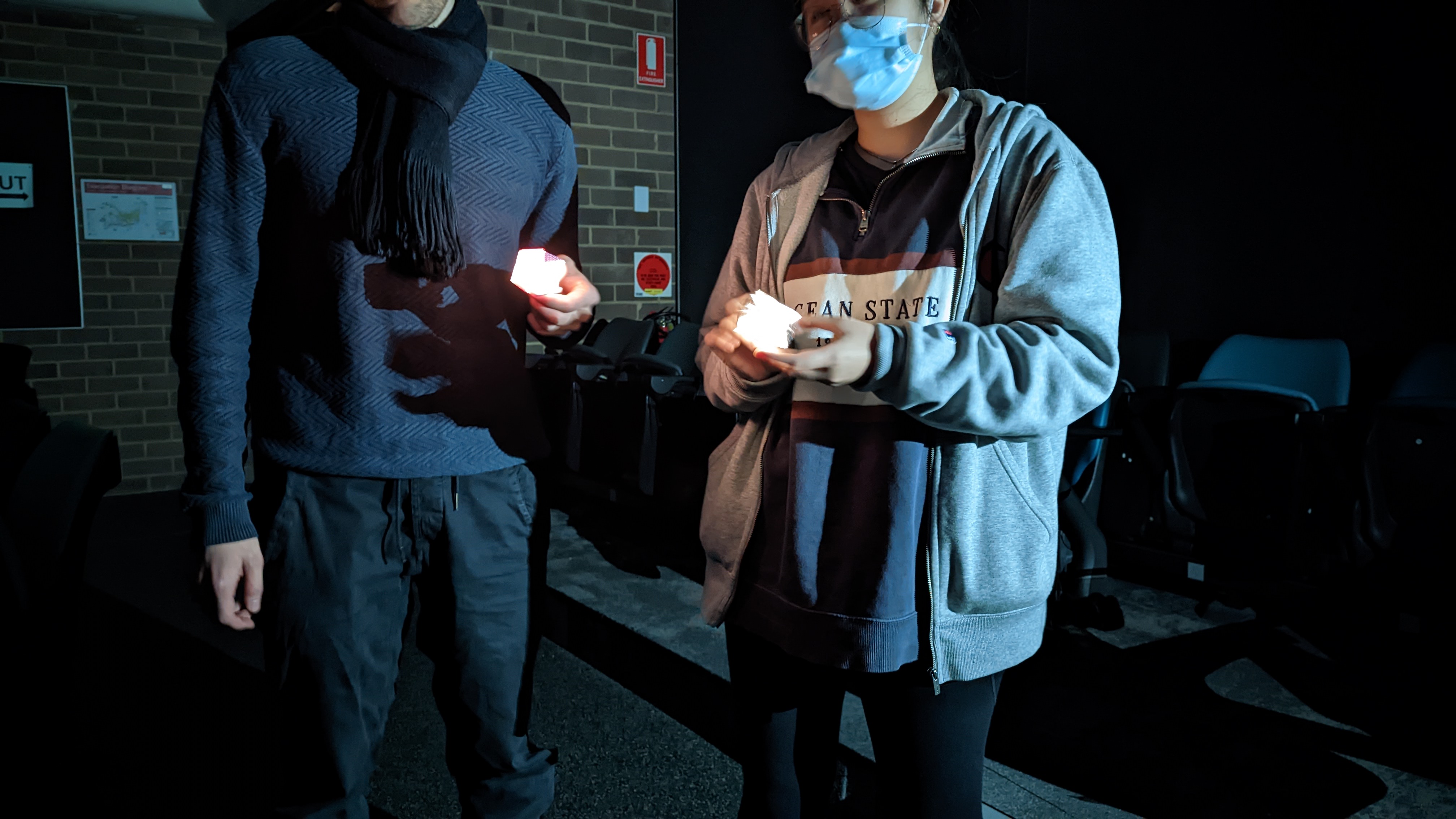
Figure 6: Users testing Safer Together (Lo-Fi Prototype)
mid-fidelity prototype
We continued to develop and iterate our concept with our mobile application and keychain becoming more defined with its main features, functions and interactions.
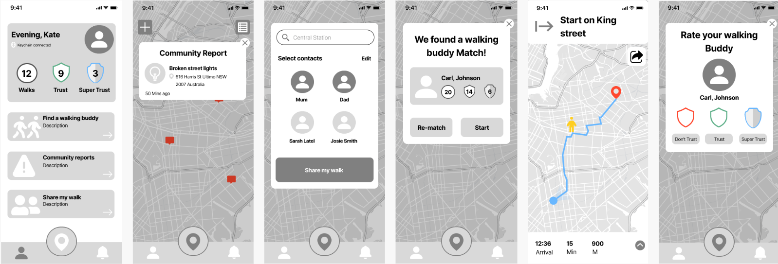
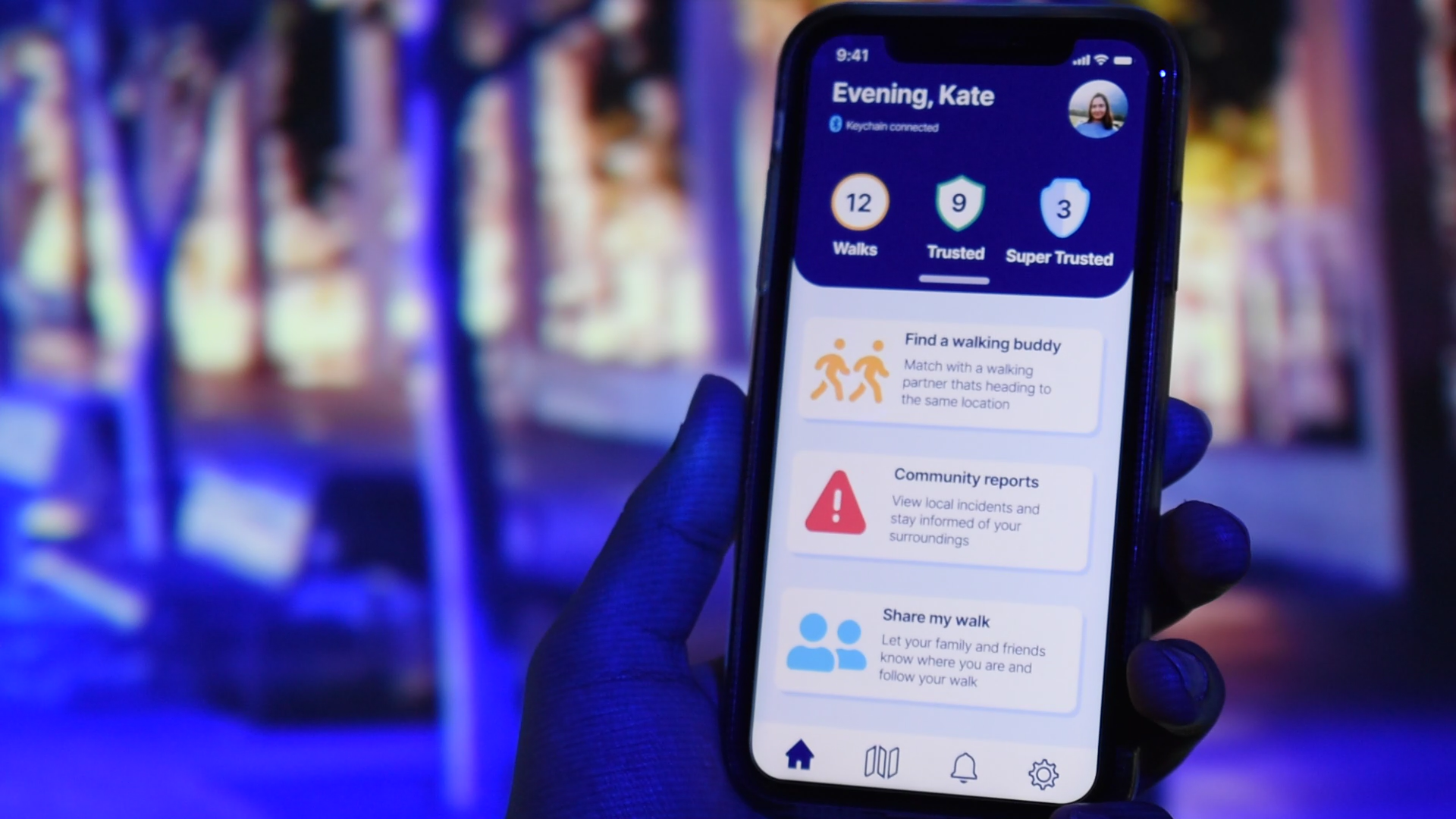
The app's interface design was revamped for a smoother navigation experience with added interactions via Figma. New features such as community reports and share my walk were added (Figure 7).
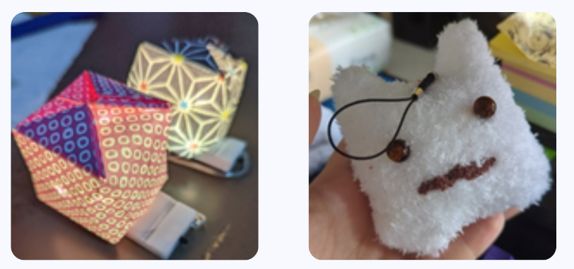
With the highly-approved physical appearance from our last testing, we kept our keychain prototype the same with the addition of a mini Bluetooth speaker that functioned as the safety alarm feature alongside the lights.
All these changes were made to reinforce the users’ night walk safety and overall user experience.
Figure 7 (Left to Right): Dashboard, Community Reports, Share My Walk, Finding a walking buddy, Rating walking buddy
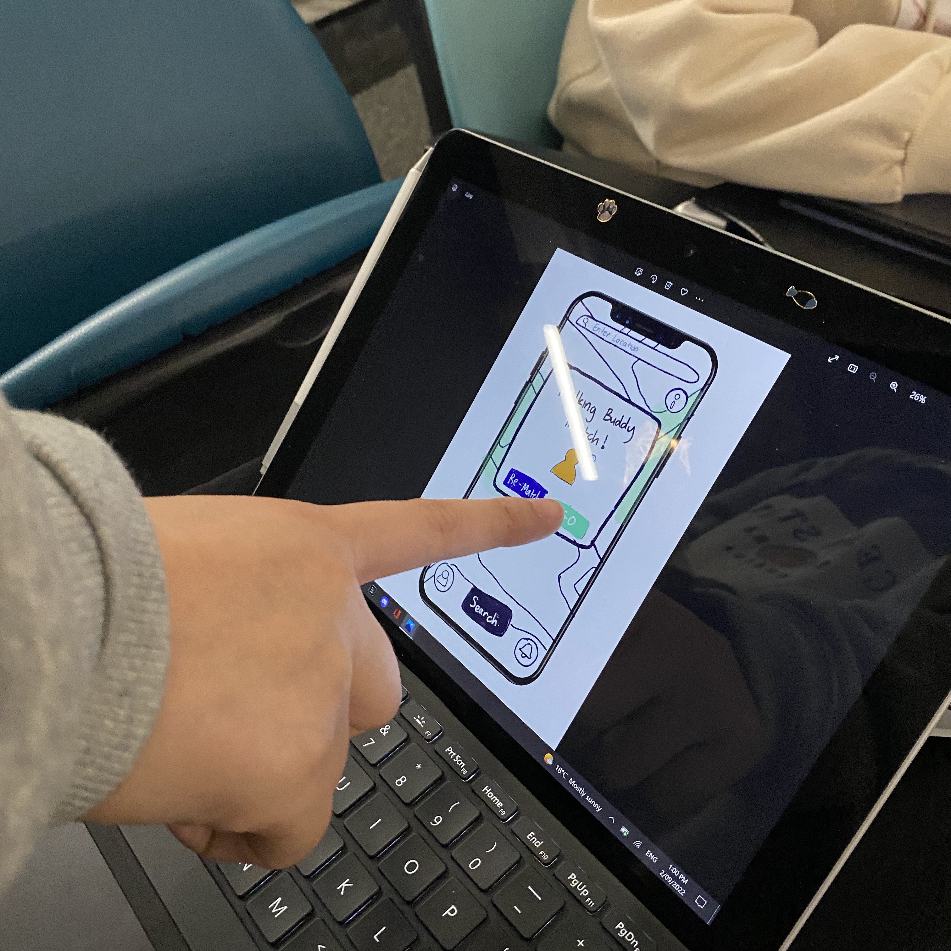
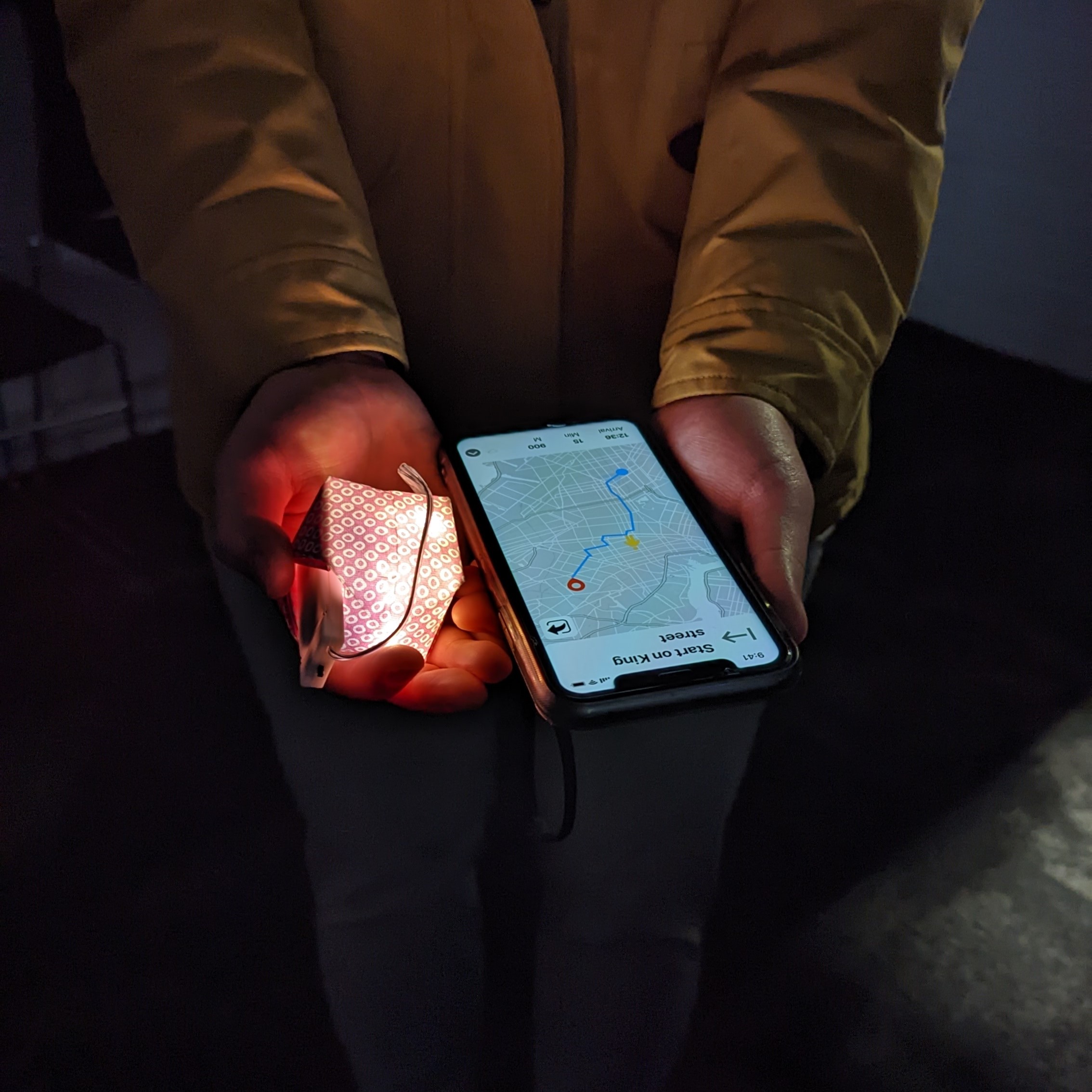
To test the user experience and flow, another round of user testing was conducted utilising an experience prototyping approach to simulate a real-life experience of interacting with our concept. Users could primarily interact with a Figma-based app prototype to complete tasks-based scenarios (Figure 8).
Figure 8: User testing the mid-fi prototype of Safer Together
high-fidelity prototype
From mid-fi to hi-fi, my team and I were able to incorporate more functionality into the keychain and features into the app based on the insightful feedback received.
Appearance-wise, the keychain was revamped into a more user-friendly housing to better portray a keychain’s functionality and initial concept sketch (Figure 9).
The brainstorming process of the keychain's housing provided to be a bit of challenge from the resources such as materials to the making of housing where we needed it to be easy to replicate for iterations.
Figure 9: Mid-Fi to Hi-Fi Keychain
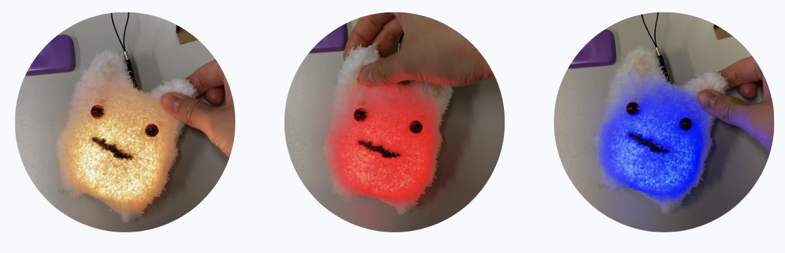
A key function that was finally added in from mid-hi to hi-fi was the dynamic light colours to represent the different modes (on/off, alarm, discovery/pairing) (Figure 10).
Figure 10 (Left to Right): On/Off, Alarm & Discovery/Pairing Mode
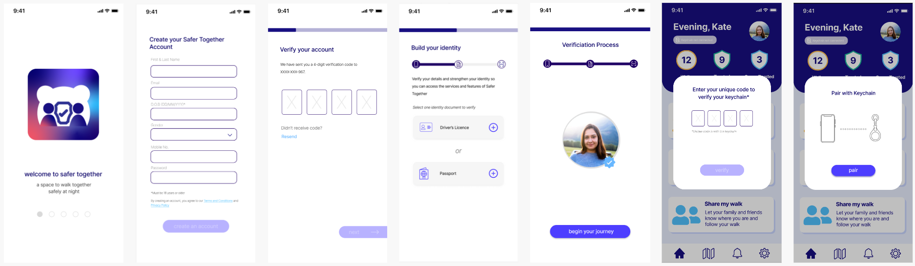
Moving to the app's interface, multiple changes were made to ensure an smoother and more user-friendly experience. An essential addition was the onboarding process that users learn about the main features of Safer Together, creating an account, verify their identity and pairing their keychain before having access to the app's full features(Figure 11).
Figure 11: Onboarding Process of Safer Together (Condensed Version)
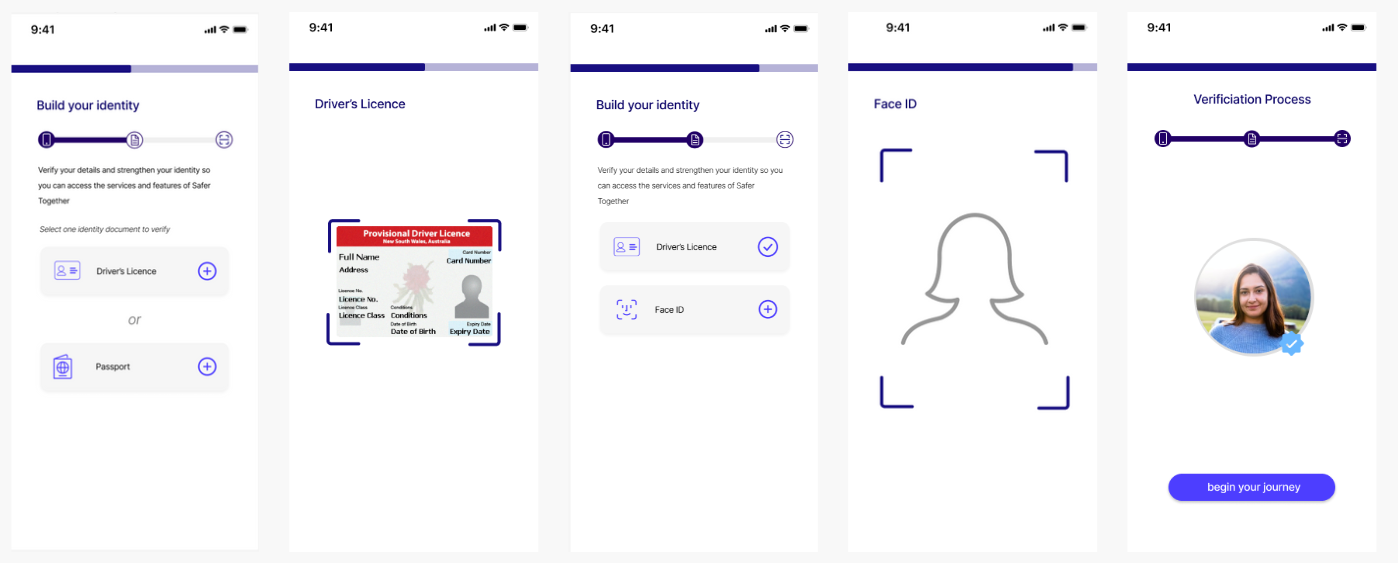
While the onboarding process is quite long, a crucial part of this process is the 'Build your identity' section where it was important to us that users' privacy and security were protected with every interaction they made with Safer Together (Figure 12).
Figure 12: Build your identity process
To further refine our prototype and overall user experience, a usability test was conducted to gain insightful feedback and suggestions in improving the design and user flow of Safer Together.
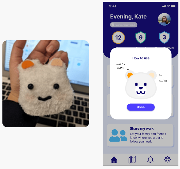
One key iteration made from user testing was adding different-coloured ear patches on the keychain for a clearer indication of button functions as users were unclear on them when testing.
In addition, a how-to-use screen was also added that pops up after the user connects their keychain with the app for the first time (Figure 13).
Figure 13: Felt patches on the ears & How-to-use screen
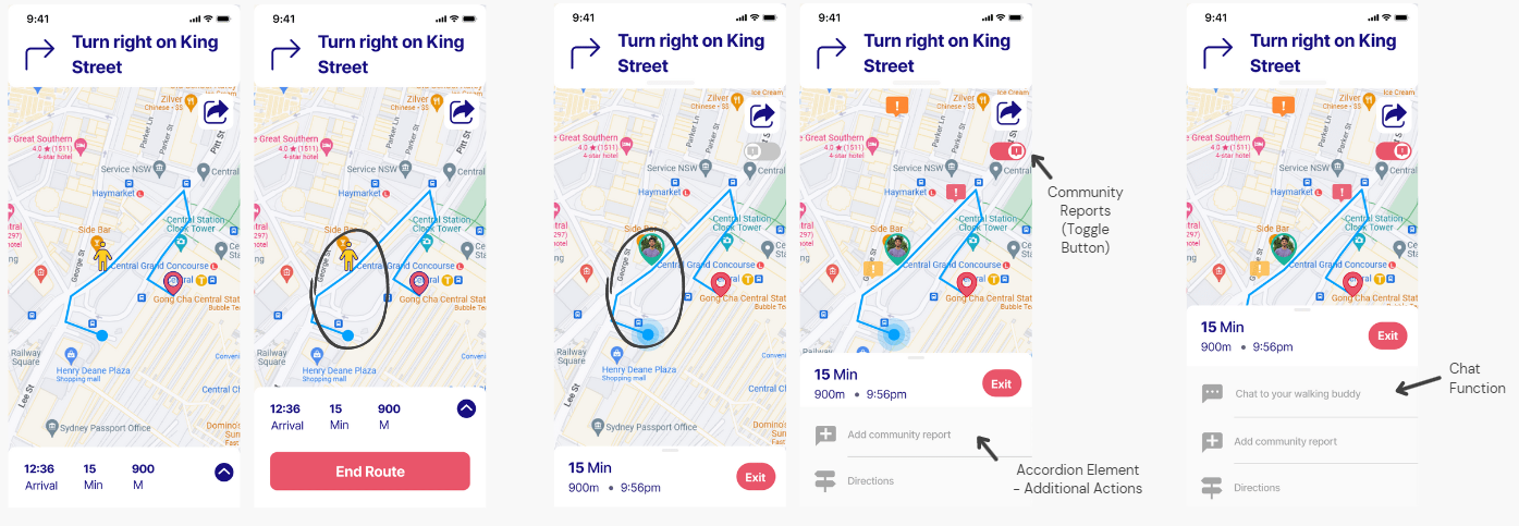
Another key iteration was our 'Meeting with Walking Buddy' where the screen was completely redesigned after it was noted by users that the navigation details bar wasn't the most user friendly and the map icons were often misinterpreted. The map's icons were revised to show a clear indication of the user's current location and their walking buddy's location.
The navigation menu was revamped with more action elements for users such as 'Add a community report' which was suggested by a user on being able report something unsafe while walking. After a suggestion from an design expert, a chat function was also added into the menu that allows users to chat to their walking buddy prior to meeting them (Figure 14).
Figure 14 (Left-Middle-Right): 1st Iteration, 2nd Iteration, Final Iteration
From the walking buddy feature to the sound of the alarm were amongst the countless iterations made to reach our final version of Safer Together. Interact with the Safer Together app HERE!!
After a culmination of 13 weeks, my team and I presents Safer Together - a multi-functional app and personal keychain designed to create space to walk together safely at night. At the beginning, this project appeared largely impossible especially with the time period given to complete each step to achieve a fully functional physical and digital prototype by the end.
However, this project allowed me to grow and improve my interface design skills through Figma while also teaching me the importance of planning and dividing up tasks to each team member with a deadline.
The final result exceeded our expectations where my team and I achieved a high distinction grade and had the privilege of showcasing our project at a graduate exhibition show, alongside our fellow classmates where the public could interact with our prototype.