Space travel - a topic that has enraptured and intrigued humankind for many decades where science, innovation and technology have all worked together to achieve this. As technology continues to rapidly advance and partnerships between private companies and the government emerge, the idea of space tourism and interplanetary transport systems in near future is very much possible.
Aligning this with our brief, long interplanetary travel in a zero-gravity environment presents a number of challenges and negative effects to arise especially on a human’s overall health and well-being.
The Nutridiario project aims to tackle the potential challenges of maintaining and measuring an individual’s nutritional health in a space-flight environment 50 years into the future with an innovative and novel screen-based interactive solution.
Photo by Jeremy Thomas (Unsplash)
our solution
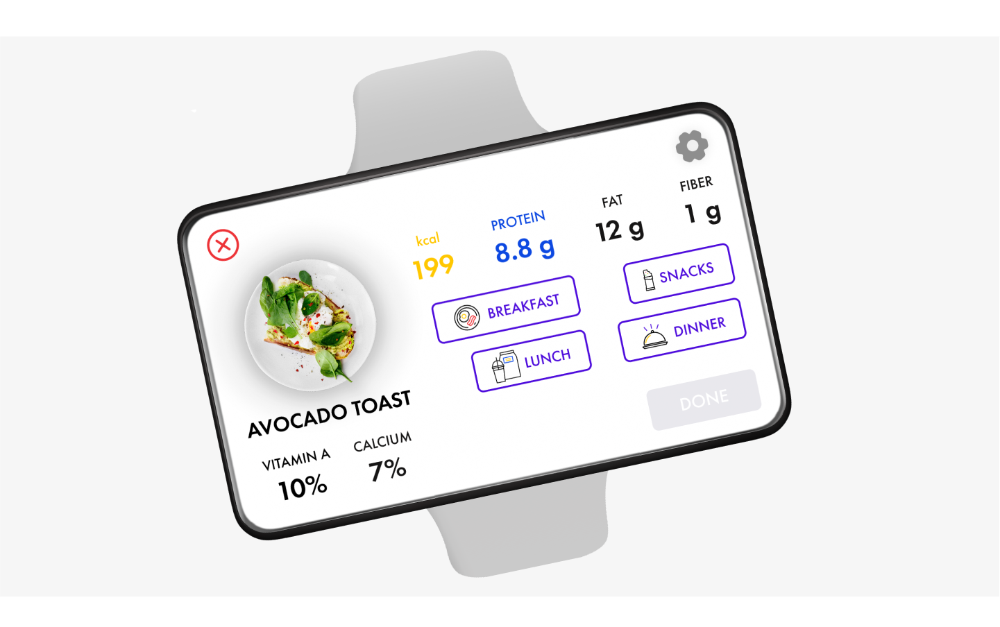
Nutridiario combats this problem of maintaining nutritional health through tracking and recording food in a interactive and engaging experience. This solution consists of a wearable device with a flexible display and near-infrared sensor that functions as a food scanner, located at the back of the wrist. This device enables users to scan and log their food with a wave of their hand onto the flexible display where they are able edit, delete and share their food logs with their friends and family.
the design process
understanding the problem
To better understand our problem space, we conducted initial background research about health and nutrition in space and the challenges and, effects faced by astronauts. From this, we were able to approach our problem through two different lens:
Measuring nutrition in space
Maintaining nutritional health through space food
user research
With two different perspectives to our problem space, each team member further researched one of the two using methods such as online ethnography and competitor analysis to gain a deeper and insights into their chosen lens of the problem. Our individual research findings and themes were collated, reviewed and identified into these four main insights (Figure 1).
Figure 1: Four main insights identified from our collective research
From these main insights, we proceeded to focus on the insights related to measuring nutrition due to the fact that addressing the latter insights would of proven difficult and out of our area of expertise.
ideation
initial concepts
To address and design for these two main user needs, we proceeded to generate 8 ideas using Mind-mapping and sketching to explore and visualise our potential solutions from a space clock to Amazon Go-inspired kitchen.
From our initial ideation phase, we began to narrow down our ideas into four concepts: a food scanner glasses, a blood analysis watch, food diary app and a personal smart space fridge (Figure 2).
Figure 2: Initial Concepts
concept development
All four concepts were developed further with research on emerging technology and feedback received from our tutor. For example, the food scanner glasses were changed to a wearable device to be worn on the wrist with the scanner to be located at the back of wrist with a gesture-based interaction. This allowed for the concept to be more inclusive and accessible for all users - vision impaired or not, to utilize it while also improving their overall user experience.
To assist in deciding on our final two concepts, the Harris Profile decision matrix was utilized with our own set of criteria to easily identify the strengths and weaknesses of each concept (Figure 3). As seen below, our watch and food scanner wearable concepts demonstrated to be the best two concepts in prioritising individuals’ nutritional health in a space-flight context.
Figure 3: Harris Profile Decision Matrices
No items found.
low-fidelity prototypes
Our two concepts were further developed to positively meet the “Encourages new behavioural changes” criteria. An automatic scan feature was added to NutriNow (watch) where the scan would perform at certain intervals set by the user and notify the user once complete. While, a share feature was added to Nutridiario (food scanner wearable) that enables users to share their daily food log or their scanned meal to their friends and family (Figure 4).
Figure 4: Share Feature Screen - Sketches
We proceeded to conduct user testing with 5 participants for each concept using paper prototypes and think-aloud tasks to continue to develop both prototypes with the user feedback received (Figure 5).
Transitioning from paper prototypes to wireframes, we able to focus on the structure and hierarchy of each display through the use of design principles with the user feedback received (Figure 6 & 7).
Figure 6 (NutriNow - Left to Right): Your Current Levels, Selected Level, Start Scan, Food Recommendations, Effects
Figure 7 (Nutridiario - Left to Right): Home, Food Scan Results, Add to Log, Food Log, Share
To identify any usability flaws, a usability testing was conducted with 5 experts using Nielsen’s 10 Heuristics engaging with our lo-fi prototypes via Figma (Figure 8). An overall goal and a set of realistic task scenarios were created for each concept to assist the participants in engaging with the interface to complete the tasks.
Figure 8: Nutridiario user goal (Left) & NutriNow user goal (Right)
Each concept revealed their own set of flaws and issues that prompted for further improvements in the next iteration round. To wrap up our low-fidelity iterations, journey maps were created to summarise each proposed concept.
high-fidelity prototypes
Due to the time and resource constraints, developing and prototyping both concepts deemed impractical and time-consuming. After reviewing the feedback received and conducting a decision matrix, Nutridiario proved to be the best concept to further develop and refine into a high-fidelity prototype. Before proceeding to create our high-fidelity prototype, a style guide was created containing essential UI elements to ensure consistency throughout the interface (Figure 9).
Figure 9: Nutridiario Style Guide
From lo-fi to hi-fi, we were able to implement several changes and improvements into the interface based on user feedback received to ensure a smoother user experience and interaction (Figure 10).
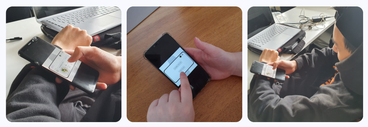
We conducted a round of user testing with 5 users using think-aloud, post-experience interviews and a System Usability Scale (SUS) test to improve and refine Nutridiario’s overall user experience and interaction design (Figure 11). This allowed for insightful feedback and suggestions to be received where current features were simplified and new features were added.
Figure 11: Users testing Nutridairo via Figma
For example, users were confused on what action to take next after the how-to-scan screen. To solve this, the screen was redesigned into an overlay screen with a continue button and an animated hand icon added to guide first-time users on how to correctly scan their food. This allowed for a more clearer and engaging interaction. After a suggestion by a design expert, the “Don’t show this again” option was added to improve user flow after users are familiar with the process (Figure 12).
Figure 12 (Left to Right): Lo-Fi, 1st Iteration, 2nd Iteration, Final Version
Another key iteration was the “Food Log” screen in which the navigation was moved to the top of the screen to avoid blocking any food entries. A delete function was added in to allow users to delete accidental or unwanted food entries from their log (Figure 13). This was implemented after an expert identified a minor usability problem in not exercising user control and freedom.
Figure 13 (Left to Right): Lo-Fi, 1st Iteration, Final Version (Delete Feature)
From hierachy changes and icon revisions to improved error prevention and user feedback, our final version of Nutridiario can be interacted with HERE!!!
Nutridiario Full User Flow
conclusion/key takeaways
When given this broad brief, this project seemed both daunting and fun in designing a futuristic solution for space where we needed to think outside of the box especially due to the pandemic where all team collaboration was conducted online was a challenge within itself. However, I was able to learn about the importance of user flow and interaction design as well as learning the iteration process from low-fidelity to high-fidelity. The final product exceeded our expectations immensely.


.png)

